Reflection

Reflection

Monday, December 11, 2017

Choose Your Battles: ArchiTalks

You have to choose your battles.  A few years ago, we went down to Virginia to meet with the local code officials about an impending project for a preliminary plan review.  Every jurisdiction is different in how they apply the codes and we wanted to get everything straight before we got close to formally submitting plans for approval.  The Code Official and the Senior Plan Reviewer were there as well as two representatives from the Fire Marshal’s office.  Everything went fine and we asked our questions and we were able to judge how this jurisdiction was going to be to work with.

When we ran out of our prepared questions, we asked if anyone there had any pet peeves or things they like to see.  It is good to ask this but it is a bit of a loaded question and can also be the opener to the proverbial Can ‘O’ Worms.  It turns out the Fire Marshal doesn't really like vinyl siding or engineered lumber (TGI’s).  Their reason for the aversion: vinyl siding “is like solid gasoline” and “TGI’s fail too soon”.  Now, both of these items are tested and rated like any other construction material.  Both sides of the table knew that the design called for both, and both sides also knew that it was perfectly acceptable, according to all prevailing building codes.  The fact that they don’t like those materials really didn't matter much.  But for a response, we listened and nodded our heads and that was it.  We all knew those two products would be in the project in the end and arguing about it now would only cause our local hosts to feel less amiable towards the out of town architects.  So we basically zipped it while we indicated we understood their point of view.

Melted vinyl siding as a result of a fire.  Photo Credit:  Scott Eklund/Seattle Post-Intelligencer
A little like insanely hot silly string when engulfed, I bet.

Okay, these TJI's might fail on the right...  Photo Credit:  Weyerhaeuser.com.
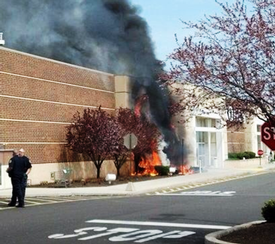
But their pet peeves were something I had not heard before, and they weren't done there.  We were only about 2 ½ hours away from our home office, in basically the same climate zone, but apparently down there mulch in planting beds will ignite and consume buildings with fire.  The Fire Marshal asked that we keep mulch as far away from the building as possible.  Their cautionary tale is an example I wish I was creative enough to imagine on my own.  Picture it.  It’s free Pancake Day at the local IHOP and the line is wrapped around the building.  (Pancake Day is March 7th in 2018, so mark your calendar).  Someone in line thoughtlessly flicks a lit cigarette into the IHOP’s mulch bed.  Poof – the solid gasoline, I mean vinyl siding, bursts into flames.  No one was hurt, but many a folk went without their free pancakes.

Mulch fires do happen apparently...  Photo Credit:  Trappefire.org.


What do you say to that?  In the end we said we would talk to our landscape designer about running a boarder of pea gravel around the building in lieu of pushing mulch beds right to the exterior walls.  But in reality, we know we wouldn't be able to pay for all that gravel.  There was nothing else we could have said to assuage their fears.  Our meeting was over, it was lunch time, and suddenly we were in the mood for pancakes.


This post is part of the ArchiTalks series where a group of us (architects who also blog) all post on the same day and promote each other’s blogs. This month’s theme is "Eureka" and was led by Stephan Ramos.  A lot of other talented writers who also are architects are listed below and are worth checking out:

Mark R. LePage - EntreArchitect (@EntreArchitect)
Limit Their Stress By Limiting Their Choices
Eric T. Faulkner - Rock Talk (@wishingrockhome)
Choices -- Your turn
Brian Paletz - The Emerging Architect (@bpaletz)
A million choices
Jeffrey Pelletier - Board & Vellum (@boardandvellum)
How Do You Deal with Choices During the Design Process?
Lee Calisti, AIA - Think Architect (@LeeCalisti)
choices
Keith Palma - Architect's Trace (@cogitatedesign)
Slow… merge… stop
-->Michele Grace Hottel - Michele Grace Hottel, Architect (@mghottel)
"Choices..."

-->Lora Teagarden - L² Design, LLC (@L2DesignLLC)
Choices


Tuesday, November 7, 2017

Eureka!

The ArchiTalks theme this month required some reflection.  In terms of major discoveries in my development and career as an architect, I don't really think in terms of surprise

revelations.  As with projects during my 20 plus years, typically the path is long and full of hard work and coordination with others.

I do, however, recall a poignant moment I experienced in my first year at school.

First Year was a bit of a struggle for me.  I had coasted through high school, really.  I was in the top 2% of my class of 300, and never really had to try that hard.  At least not like I had to in college.  I worked, don’t get me wrong, but I didn’t know what work was until architecture school.  Design Studio was a real adjustment.  I initially applied the same worth ethic  in that class as I had in high school classes.  I was always there and I always did what was asked.  But never more.  And in architecture school, that is only good enough for a B, B- maybe.  Sometimes a C+.  Along with all my other classes, I was still able to scrape together decent grades for the first semester.  But as Design Studio was approximately one-third of your credit load, and approximately two-thirds of all the work you had to do, I was just fair to middling in my class.  We started out with a class of 75 freshman students, and as our class shrank very quickly to about 60 that first semester (due to kids changing majors), I was in the bottom half of the remaining class at that point.

This is from a later trip, thus the leaves.
In either March or April of the second semester, the entire class that remained took a trip to Fallingwater.  We loaded up three or four blue Penn State vans, full of 18 year olds and drove the three hours to Mill Run, PA.  It was pretty dreary weather, as Western PA tends to be in early spring.  There weren’t too many leaves on the trees yet either.  In spite of all that, we were about to take over the most famous private residence in the entire world.  I didn’t know it yet but it would change my attitude, and my life.

The Money Shot
Our group pretty much had the run of the place.  As I recall we had almost unlimited access.  Most people have that one “money shot” looking up at the cantilevers from the water in their mind when they think of Fallingwater.  And while that was amazing to see for the first time, my moment came in a much more secluded and private location. But you can imagine, 18 year olds set loose on the grounds was bound to  unleash some shenanigans.  Kids were all over the stream bed, in the water.  I distinctly remember one girl had a white T-shirt on and, well, she got herself soaked.  And inside, had I been a docent that day, I would have been popping Maalox, afraid some kid would get mud on the original rugs or cushions or something.  Aspects of the interior were certainly dated, like the kitchen appliances at the time, but I was in a building unlike I had ever been before.  This was architecture.  I don’t think I had ever experienced it before.  I had hardly been anywhere before, let alone one of the masterpieces of the 20th century.  Nearly everything you saw, touched, heard or smelled seemed to be orchestrated.  How the floor bled out of the boulders forming the fireplace and spilled outside seamlessly.  How the corner windows melted away to provide unobstructed view of the exterior.  How that one beam went out of its way to allow a tree to grow through the trellis.  How that one desk has a crescent cut out of it to allow the casement window to open.

The Trellis
As the day wore on, I made my way down those stairs that literally ended at the water.  I don’t know if Edgar Kaufmann ever used that platform at the bottom to go swimming, but it doesn’t matter.  I had my moment right there.  I got it.  Architecture is not about physics or calculations or drawing straight lines.  It isn’t even about getting good grades.  Architecture affects human emotion.  That is the point.  And everything I did in school after that changed.
photo: Daderot, CC0 1.0
We got back into those buses to go home with a part of me changed.  There were still shenanigans.  I remember we stopped for gas, and while the driver/professor went to pay, the guy sitting in the passenger seat wrote in the condensation on the windshield “BIG DADDY DON” in huge letters.  Our professor's name was Don.  Hey, we were still kids.

This post is part of the ArchiTalks series where a group of us (architects who also blog) all post on the same day and promote each other’s blogs. This month’s theme is "Eureka" and was led by Stephan Ramos.  A lot of other talented writers who also are architects are listed below and are worth checking out:
Lora Teagarden - L² Design, LLC (@L2DesignLLC)
Eureka!? Finding myself amid the "busy."

Jeremiah Russell, AIA - ROGUE Architecture (@rogue_architect)
Gee, golly, gosh EUREKA: #architalks

Eric T. Faulkner - Rock Talk (@wishingrockhome)
Eureka! -- Things That Suck

Michele Grace Hottel - Michele Grace Hottel, Architect (@mghottel)
eureka!!!!

Stephen Ramos - BUILDINGS ARE COOL (@BuildingsRCool)
Searching for that Eureka Moment

Jeffrey Pelletier - Board & Vellum (@boardandvellum)
Finding That "Eureka!" Moment in the Design Process

Keith Palma - Architect's Trace (@cogitatedesign)
Naked in the Street

Mark Stephens - Mark Stephens Architects (@architectmark)
Eureka moments and what do if clients don't appreciate them

Larry Lucas - Lucas Sustainable, PLLC (@LarryLucasArch)
Eureka for George in Seinfeld Episode 181

Monday, October 9, 2017

Passing the Test

I have literally no advice for anyone taking and passing the Architectural Registration Exam today.  I am sure that was not the intent of this month's topic, but I took it so long ago...

How long ago was it?

I am glad you asked.  It was so long ago the Vitruvius only had seven Books on Architecture at that point.  John Ruskin only had five Lamps of Architecture back then.  They were just digging the foundation for This Old House...
From my yearbook...

Alright, it wasn't that long ago, but I did begin in 1999.  It was version 1.0 of the fully computerized test, I believe.  I couldn't wait to get it done.  I think the fact that I didn't know what to call myself until I did finish the exam pushed me.  I was once introduced to a client as "an intern" after a few years on the job.  Then the client asked when I went back to school.  Come on, man!

I completed my hours for the Intern Development Program (now called AXP) in the minimum amount of time possible and registered to take my first division of the test.  I resolved to take one division per month until I passed all of them.  There were nine divisions then.  I took the first exam in October 1999 and finished the last in June of 2000.

There were two other interns in the office taking the exams at the same time.  I remember the three of us rummaging through the mail bin to try and find our letters from the State Licensure Board to see if we passed or not.  You see, you used to have to take the exam at the testing center and leave without knowing if you passed or not.  What's more is, notification was snail mailed to you and, looking at the postmarks, we had to wait a full month after sitting for the exam whether or not you passed.  It was a painstaking wait!
This is all we got and we had to wait about a month to get it!

Older architects would regale us "newbies" on the merits of taking the entire exam over the course of several consecutive days in an old Post Office in Philadelphia, with T-Squares on old doors.  But being in the first generation of computerized testing was also a challenge.  The design software was available for download for practice for the Building Planning and Site Planning portions of the exam.  The software was was rinky-dink and fussy.  Otherwise, the tests were more or less multiple choice on the computer, which sounds easy, but I recall only leaving one exam with a feeling that I definitely passed it.  I was lucky enough to pass them all the first time, but there was one which scared to devil out of me.
Ah, the good olde days.

I forget which test it was, I think it may have been Materials and Methods, but I was at the end of one section of the exam.  Back then the computer saved each section before loading the next section  you were going to take.  After the second of three sections I pressed the "Save and Go to the Next Section" button - and I got a Fatal Error.  I had to get the test administrator to restart the computer.  The administrator couldn't tell me whether the saving "took" or not.  I was left to complete section three of three not knowing if the first two sections saved properly or not.  That was a long month to wait for a Score Report.
Never a good thing.  Really not a good thing on an exam.

Fortunately it came back as a "PASS".  But that is all they tell you in the test report.  If you failed, there was no indication on what you didn't do well on in order to study for the next time.


This post is part of the ArchiTalks series where a group of us (architects who also blog) all post on the same day and promote each other’s blogs. This month’s theme is "The Architectural Registration Exam" and was led by Meghana Joshi.  A lot of other talented writers who also are architects are listed below and are worth checking out:

Matthew Stanfield - FiELD9: architecture (@FiELD9arch)
What is the Big Deal about the ARE?
Lee Calisti, AIA - Think Architect (@LeeCalisti)
what A.R.E. you willing to do
Lora Teagarden - L² Design, LLC (@L2DesignLLC)
Take the architect registration exam, already
Eric T. Faulkner - Rock Talk (@wishingrockhome)
ARE - The Turnstile
Michele Grace Hottel - Michele Grace Hottel, Architect (@mghottel)
the architect registration exam

Brian Paletz - The Emerging Architect (@bpaletz)
I forget
Drew Paul Bell - Drew Paul Bell (@DrewPaulBell)
The Architecture Registration Exam
Jeffrey Pelletier - Board & Vellum (@boardandvellum)
What is the Benefit of Becoming a Licensed Architect?
Kyu Young Kim - J&K Atelier (@sokokyu)
Every Architect's Agony
Nisha Kandiah - ArchiDragon (@ArchiDragon)
To do or not to do ?
Keith Palma - Architect's Trace (@cogitatedesign)
Test or Task
Mark Stephens - Mark Stephens Architects (@architectmark)
Part 3!
Ilaria Marani - Creative Aptitude (@creaptitude)
How to Become a Licensed Architect in Italy
Jane Vorbrodt - Kuno Architecture (@janevorbrodt)
Seven Years of Highlighters and Post-it Notes

Monday, September 11, 2017

A Little Ugly Never Hurt Anyone

Credit:  Getty Images
Everything in moderation, or so the saying goes.  In my opinion, this holds true for both beauty and grotesque in the built environment, for without one, the other holds no meaning.  For this month's ArchiTalks, I will let my pictures do most of the talking.

You may look at the picture on the left and see nothing of merit.  How on earth can anyone help this double occupancy room?
The second picture is the same exact room.  There was potential in the room from the first picture.  The designers just had to coax it into existence.  We call it re-invention.


What's wrong with a little decay?  It may be my rural roots, but all I see is a field of new pumpkins next year.


Speaking of decay...  Actually, this one kind of hurt.  But once the damage was done, this building in downtown Lancaster held an eerie beauty.
Before this building was worked on (and inadvertently destroyed) no one ever knew about that painted advertisement on the side of the wall.
Most old buildings are drafty, aren't they?


 Speaking of painted advertisements...  I love these barn billboards.  Yeah, yeah, chewing it will give you cancer....
But just looking won't.  Hey, tobacco was a cash crop here.


This is a building in Lancaster as well, but it has been abandoned for as long as I can remember.  It was once the largest silk mill in the U.S. During the War, they made parachutes there so the windows were blackened to keep Nazi bombers from seeing it.  Over the years it settled into a state of decay that fascinates me.
Utilitarian in its nature, it is simple and brutal beauty in my opinion. The AEG Turbine Factory by Peter Behrens in 1909.
Architects have always been fascinated with decay and ruin.  The Romans built upon Greek ruins, and in turn, the West built upon Roman ruins to develop Neoclasicism.


My misguided fascination with decay may have its origins here. The picture to the left is where I studied architecture for 5 years.


This post is part of the ArchiTalks series where a group of us (architects who also blog) all post on the same day and promote each other’s blogs. This month’s theme is "Ugly" and was led by Jeremiah Russell.  A lot of other talented writers who also are architects are listed below and are worth checking out:


-->Lee Calisti, AIA - Think Architect (@LeeCalisti)
ugly is ugly

-->Lora Teagarden - L² Design, LLC (@L2DesignLLC)
Ugly Architecture Details

-->Jeremiah Russell, AIA - ROGUE Architecture (@rogue_architect)
unsuccessful, not ugly: #architalks

-->Eric T. Faulkner - Rock Talk (@wishingrockhome)
Ugly is in The Details

-->Michele Grace Hottel - Michele Grace Hottel, Architect (@mghottel)
Ugly

-->Brian Paletz - The Emerging Architect (@bpaletz)
Ugly, sloppy, and wrong - oh my!

-->Eric Wittman - intern[life] (@rico_w)
[ugly] buildings [ugly] people

-->Jeffrey Pelletier - Board & Vellum (@boardandvellum)
Is My House Ugly? If You Love It, Maybe Not!

-->Nisha Kandiah - ArchiDragon (@ArchiDragon)
the ugly truth

-->Keith Palma - Architect's Trace (@cogitatedesign)
Behold

-->Mark Stephens - Mark Stephens Architects (@architectmark)
Ugly or not ugly Belgian houses?

-->Ilaria Marani - Creative Aptitude (@creaptitude)
ArchiTalks #30: Ugly

-->Larry Lucas - Lucas Sustainable, PLLC (@LarryLucasArch)
Die Hard: 7 Ugly Sins Killing Your Community